What is a Brand Design System?
A brand design system is a clearly defined blueprint to a business’ digital appearance. It identifies how every member of your team should represent your brand in any webpage, handout, or presentation. Ultimately, brands that take the time to work with brand design consultants to create distinct elements set themselves apart from competitors and appear more modern, capable, and captivating. Investing in a brand design system refresh is one of the first steps to optimizing your business’ digital platforms.
However, a design system is more than just a collection of fonts, colors, and buttons. Through the strategy process, brand design consultants create reusable design components that streamline the creation of new webpages and digital assets in the future. With these tools, businesses can quickly build a new service page, design an advertisement, or build a deck that perfectly aligns with their branding. It saves time for team members and results in a better, more consistent product.
Brand Design Consultants: Getting an Expert Perspective
At Blennd, our design strategies clearly outline the colors, fonts, imagery, iconography, buttons, and beyond for your brand. Our brand design consultants work with your team to identify the most important elements of your branding. Then, we start uncovering ways to refresh and reimagine those pillars to appear modern, clear, and consistent.
How to Leverage a Brand Design System
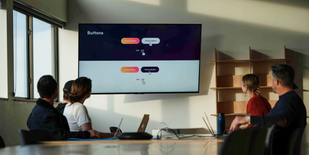
Identity
Your brand’s digital appearance is typically your audience’s first impression. In fact, a study by Gartner Research showed that four in five buyers leverage supplier websites to directly inform business-to-business purchase decisions. The same goes for business-to-consumer audiences, with more customers moving online for product research and shopping. That means that your platforms need to do the heavy lifting when it comes to representing who you are, and your unique value to customers. With so many options and direct competitors just a click away, it’s crucial to make the most of the time they spend on your website. Creating a visually appealing and instantly-recognizable brand is an important piece of the puzzle to draw them in.
Identity Case Study: Cain Travel
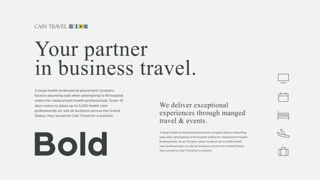
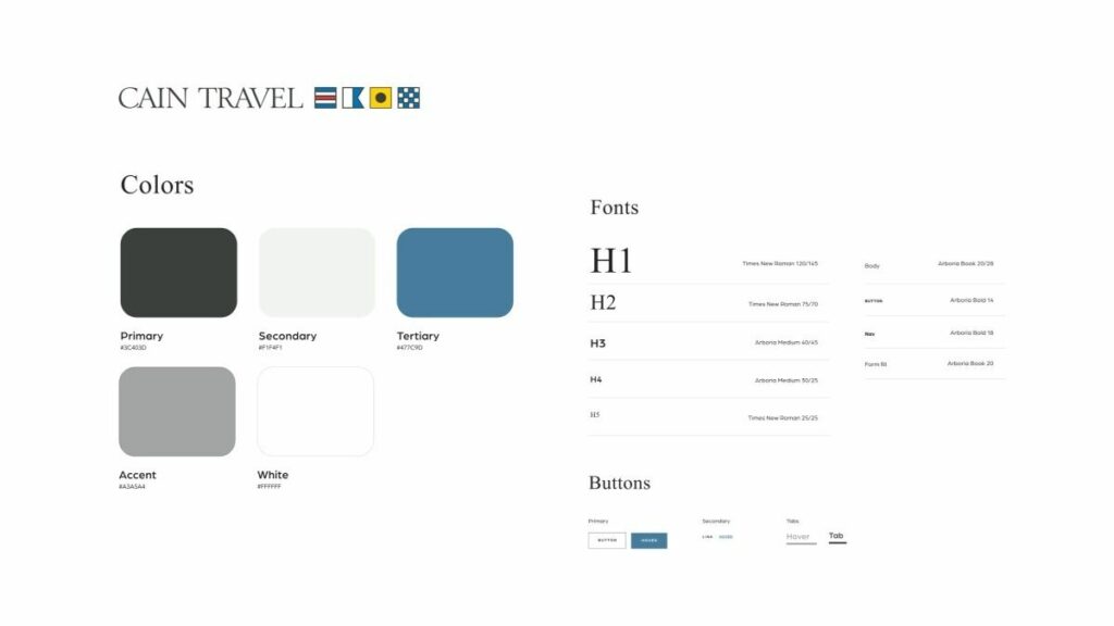
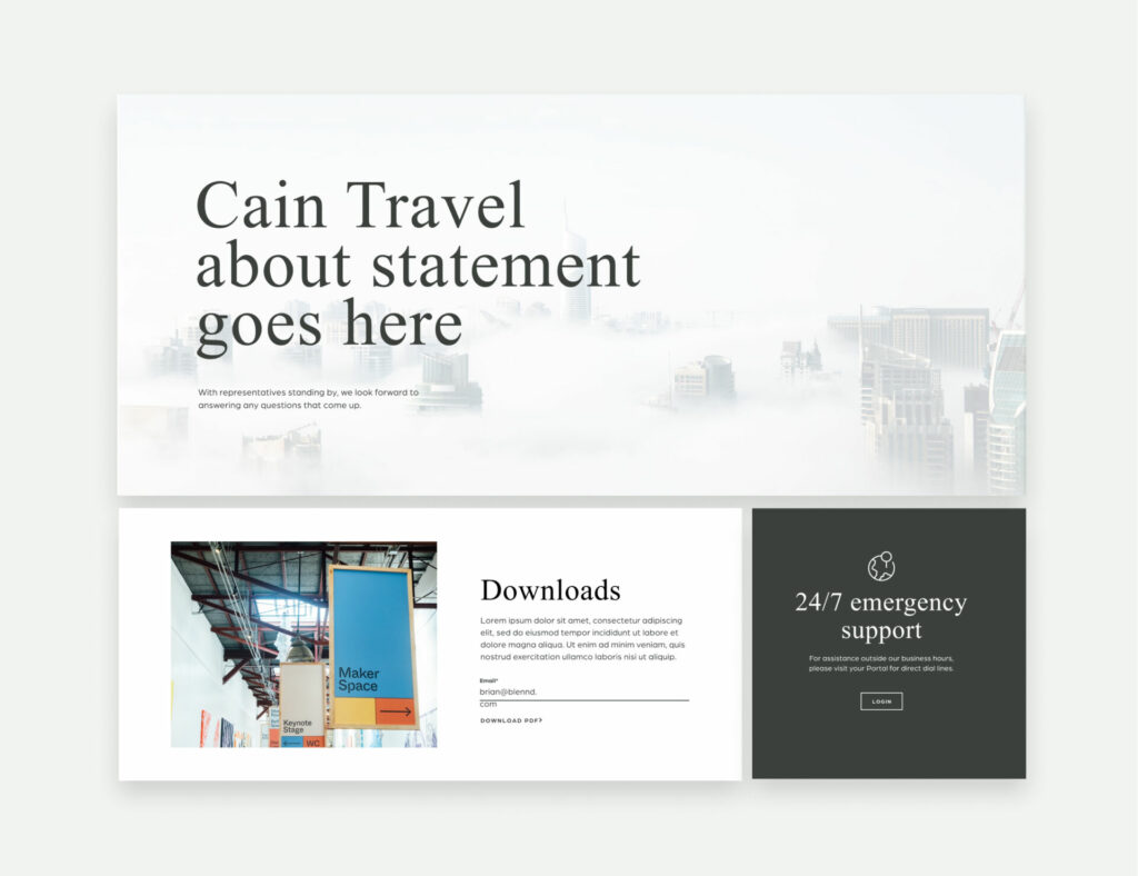
Cain Travel Agency approached our team to build out a travel agency website design that spoke to their cutting edge technology, with a nod to the timeless sophistication of the travel industry. Blennd’s Senior UI/UX Designer drew inspiration for Cain’s design system while walking through the airport. He wanted the design to look like the newspapers and magazines you read at the gate while waiting for the next adventure. We opted for a Times New Roman font, which is classic and instantly recognizable. Combined with imagery that looked like a front-page feature photo – the site took on a completely unique, timeless modern look that immediately engaged users. As a result, the platform spoke to their high-end personas and provided a clear path to get to know their brand and start services.
Consistency
Selecting various design elements is just the beginning. Implementing those features across every aspect of your brand is where many businesses cannot completely execute. Blennd’s design system strategies provide an easy-to-follow guide for businesses to remain consistent in everything that gets published on their digital platforms. Our clients typically take these guides, pass them around to every employee, and include them in the onboarding process for marketers. That way, everyone who works for their company know how to properly represent the brand across channels.
Consistency Case Study: Western Colorado University
Western Colorado University had a massive website with over 3,000 pages, many of which were outdated or unnecessary. Since the school had so many departments, and so many people making changes to the website, it was impossible to maintain brand standards for design (or content, page structure, and imagery for that matter). The first thing Blennd did for the Western project was build out a comprehensive brand style guide that outlined every aspect of their design system. These included logo usages, typography, colors, iconography, pagination, tables, and beyond. As an ongoing partner, Blennd also plays a key role in maintaining these standards, completing branding audits for all web pages, image changes, content updates, and more before publishing. Together, the new school website design and ongoing optimizations have led to massive growth for the university.
Modernization
Your business focuses heavily on optimizing your products and services, but does your brand design system reflect that? An outdated digital presence negatively influences your audience’s perception of your product — and can make an entire business appear antiquated. Refreshing a digital brand strategy requires looking at the latest trends within your industry and the digital marketing space — and making adjustments to ensure your brand stays ahead. By adding a modern appearance and cutting-edge tech throughout the platform, your audiences can feel confident that they are working with a business who understands the current market and keeps up with the constantly evolving digital space.
Modernization Case Study: Moody Insurance Agency
Moody Insurance came to Blennd with an antiquated insurance agency website design that was super slow to load and did not convert users. While they had some style standards on their site, their team was unhappy with the way the current look reflected their modern business and services. Their team emphasized a strong business culture and dedication to serving Coloradans. To highlight these important aspects of their personality, Blennd‘s brand design consultants developed visual standards for their photography – prominently displaying the people and landscapes in the state. Meanwhile, we maintained their longstanding red color pallet, but recommended some brighter hues and complementary whites to liven up the pages. These changes, combined with the tech optimizations resulted in a big boost in traffic post-launch.
Accessibility
Nearly every new client that we work with has some sort of web accessibility issue when it comes to their design system. At Blennd, we build out our designs to align with the Americans with Disabilities Act (ADA). This is a set of standards for colors, font sizes, and other accessible design elements that make finding information easier for those with disabilities. Some of the audits that our brand design consultants run include color contrast audits, document outline and heading audits, alt text image audits, video caption audits, tabbable content and keyboard navigation audits, screen reader text audits, and Aria Labels audits. Combined, these adjustments allow more people to utilize your website and increase the overall accessibility of your brand.
Accessibility Case Study: KIOSK Information Systems
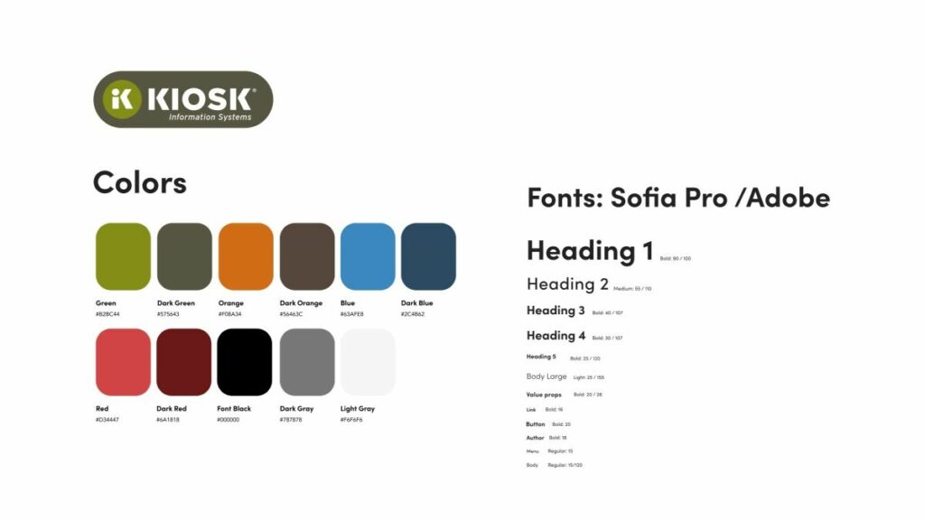
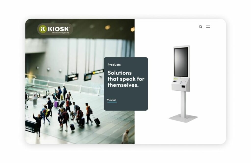
KIOSK Information Systems was a client who had a defined color pallet, reflected throughout their original website, logo, and imagery. The issue? The color contrast within that pallet did not pass ADA testing. To address this, Blennd recommended a pallet of complimentary colors that worked with their original hues to improve the contrast and ensure ADA compliance. This not only made the site easier to read for individuals with vision impairment or color blindness, but also provided a more interesting and dynamic appearance to the tech product website design. It’s crucial for tech companies like KIOSK to prioritize website accessibility to properly reflect their high standards for compliance in their software and devices.
User Experience
Ultimately, the design system works together with technology to create a stronger user experience. Creating a clearly defined system and predictable pattern throughout a website removes distraction and creates a clean, seamless path to conversion. Elements like headings (or H-tags) act as anchors throughout a website and build a hierarchy of information. Custom icon sets and button designs provide context to services and allow for dynamic animations that encourage people to click through and learn more. Maintaining a high-quality, user-centric appearance that engages users can decrease the bounce rate, boost session time, and improve the perception of your brand to empower stronger business growth.
User Experience Case Study: Inflow Communication
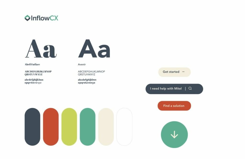
Inflow Communications is an UCaaS/CCaaS IT service provider that worked with Blennd to build a stronger brand identity and user experience on their website. After listening to their team and dropping a heatmapping tool on their site, we found that one of their biggest value propositions was people-first service. There are a lot of common themes on IT company websites designs — the industry tends to stick to very masculine fonts and techy blue color pallets. Blennd wanted to bring a human, approachable, and varied color pallet, icon set, and font treatment to their brand – that better balanced the masculine and the feminine design elements. We played with more rounded edges and interesting animations to encourage clicks and interaction. Ultimately, all of these elements combined to build a strong, results-focused user experience that earned a ton of attention and engagement from visitors post-launch.
Grow Your Business with World-Class Brand Design Consultants
Ready to start building your modern brand design system? Blennd’s brand design consultants provide research-backed recommendations that will modernize your business’ look, improve accessibility, and enable stronger business growth. Contact us today to discuss building a strategy to bring your brand into the future.

