Industry
Hospitality & TravelProject Overview
A sharper digital presence for a travel company that had outgrown its website.
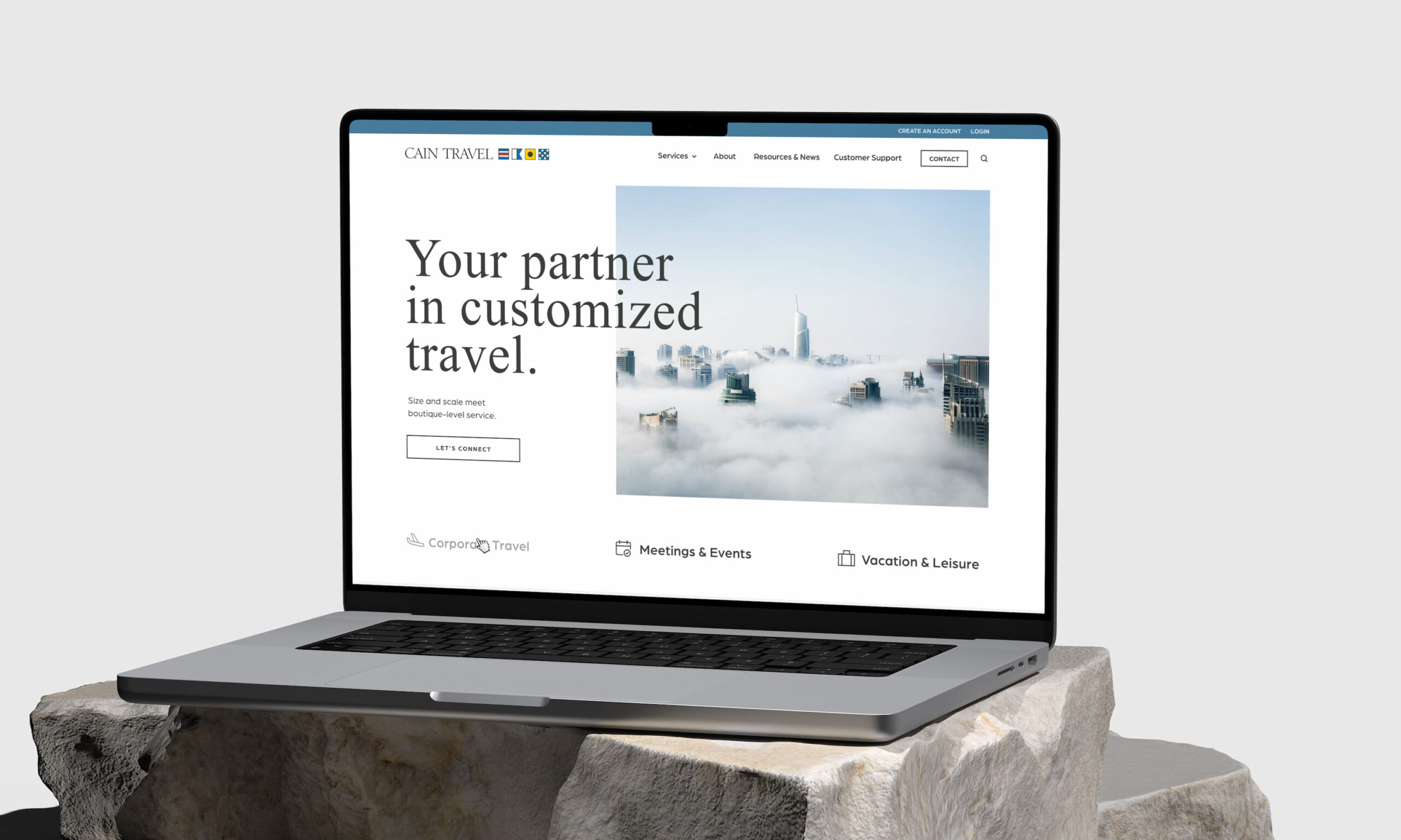
Cain Travel had evolved far beyond the expectations of a traditional leisure travel agency. While the business still supported vacations and personal travel, its core strengths had expanded into corporate travel management and meetings and events, supported by sophisticated technology and a high-touch client experience. The problem was not the business itself. It was that the website no longer reflected the level of service, specialization, or operational capability Cain had built over time.
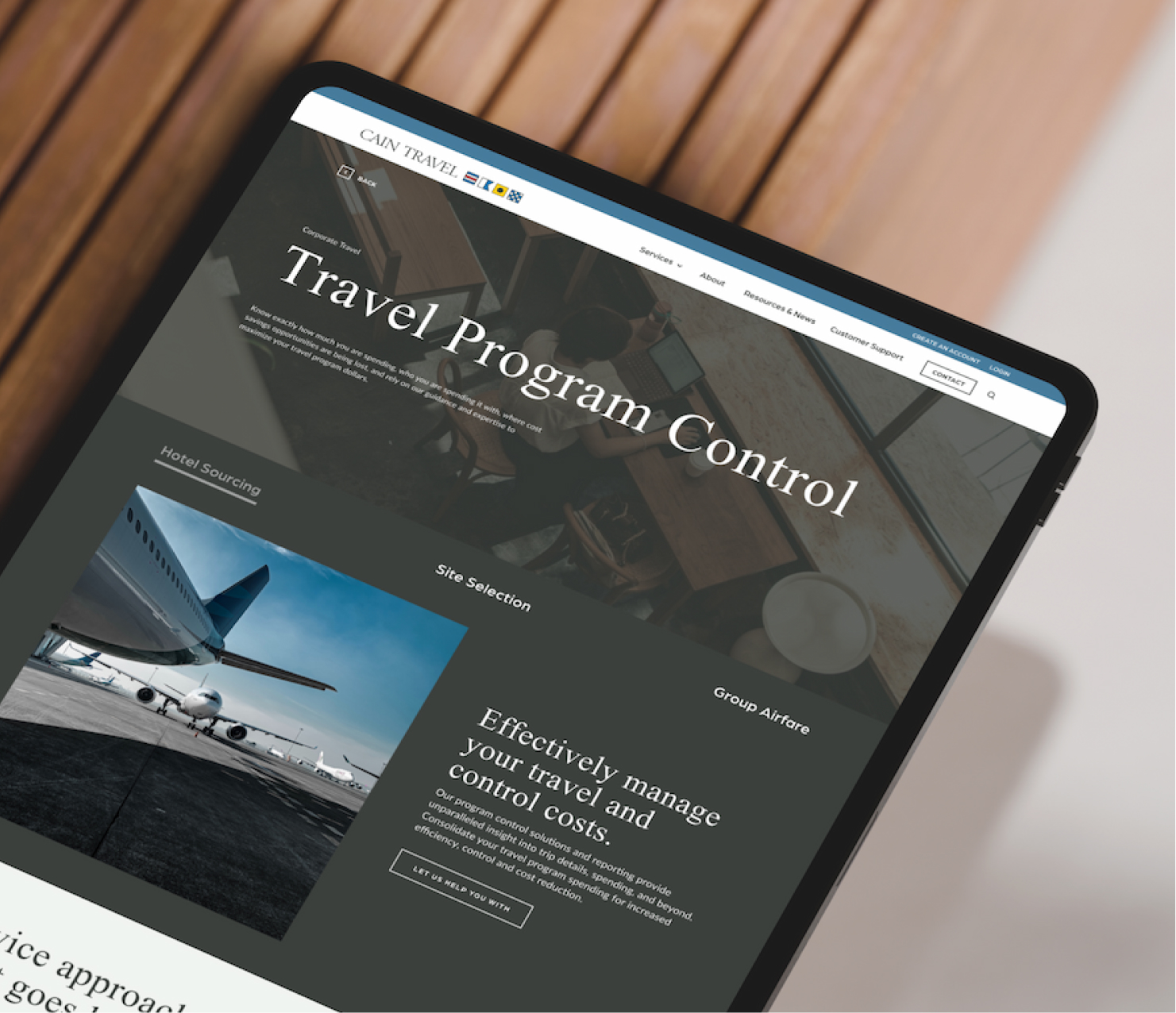
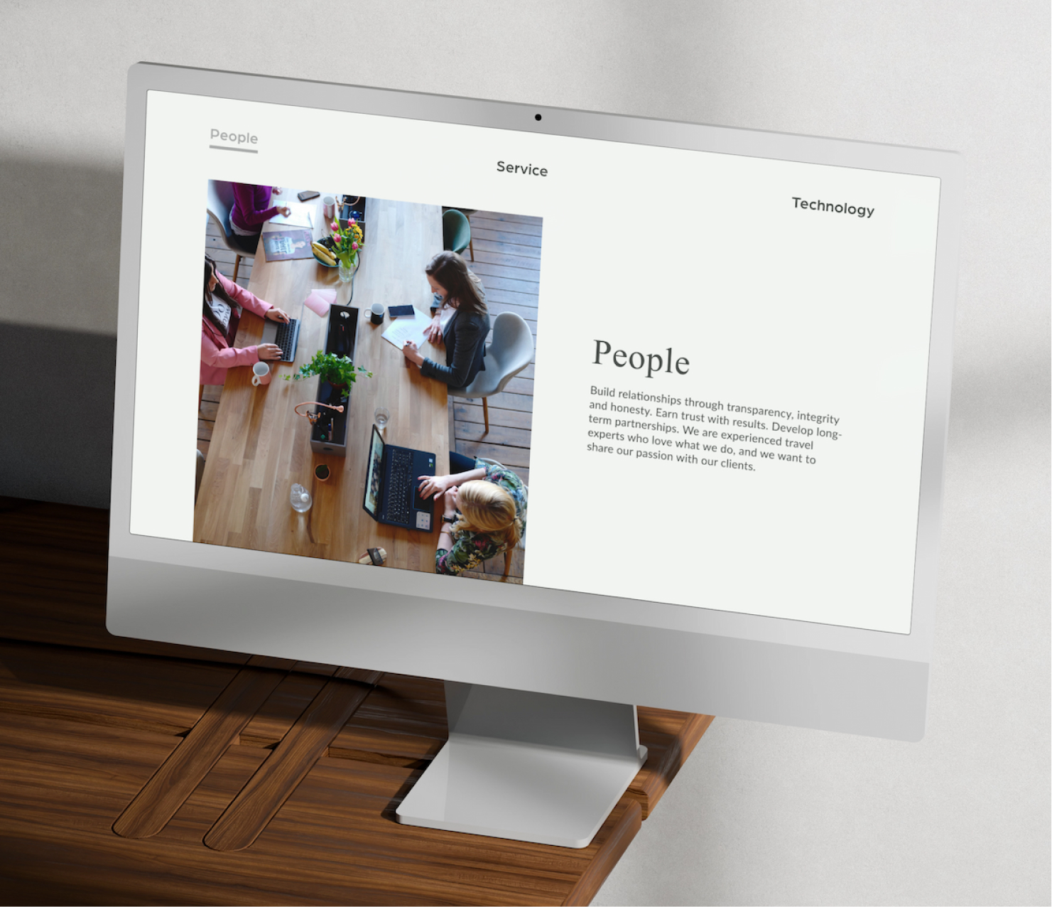
Blennd partnered with Cain Travel to modernize that experience from the ground up. The engagement combined website strategy, brand strategy, UX/UI design, custom development, and SEO planning to create a digital presence that felt more aligned with the company’s real strengths. The result was a more intentional website built to better support users, clarify Cain’s evolving services, and present the brand with greater confidence and sophistication.
New organic keywords in 30 days
Cited pages in AI search
Increase in organic traffic

The Challenge
The business had advanced, but the digital experience was still telling an older story.
Cain Travel had invested heavily in technology and client support, creating systems and tools that exceeded much of the industry standard. But its website still projected an outdated image that no longer matched the company’s capabilities. The experience lacked the clarity, hierarchy, and modern design needed to communicate Cain’s expertise in corporate travel, meeting coordination, and complex support services.
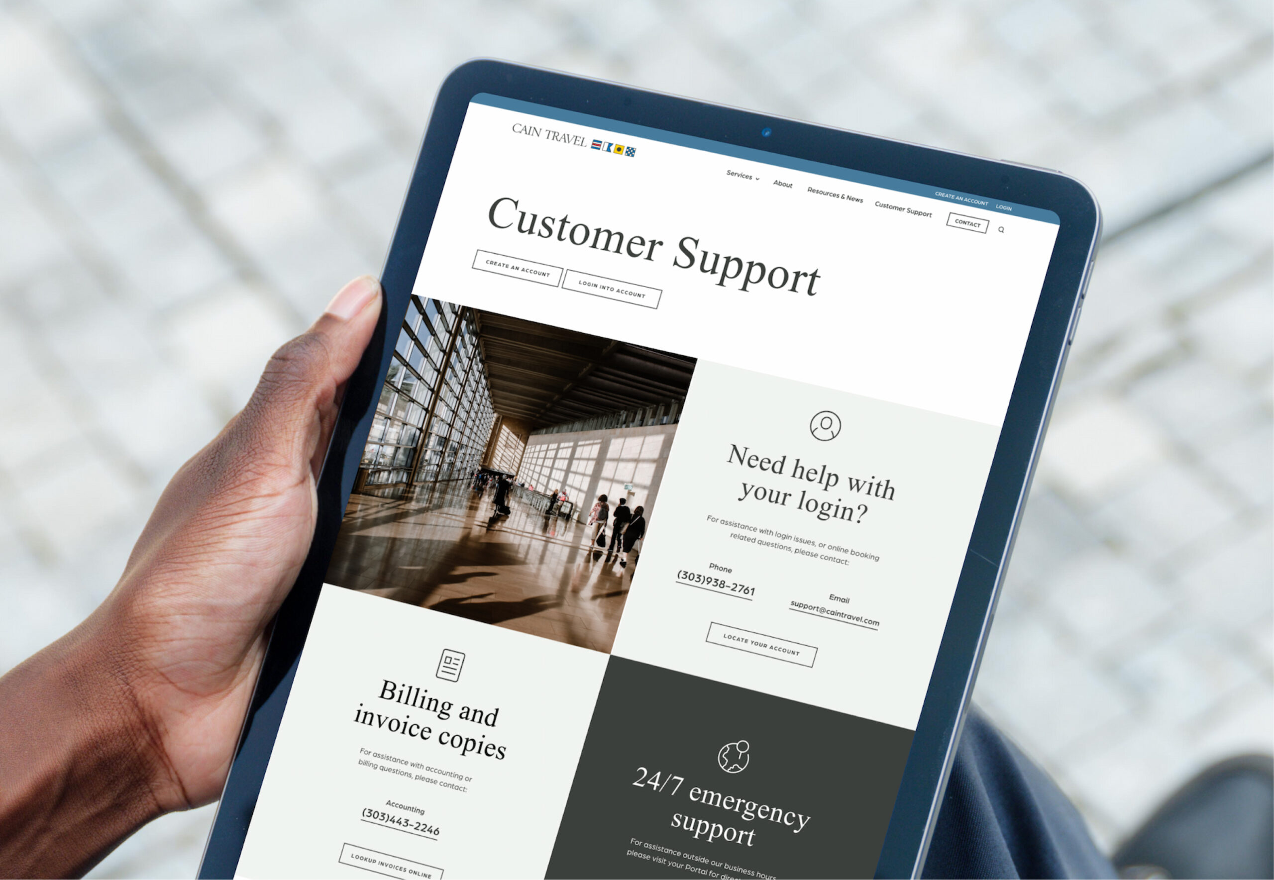
There was also a more practical UX challenge beneath the surface. Research revealed that users were heavily engaging with support content and time-sensitive travel resources, yet those elements were not positioned where users could easily find them. The site needed to do a better job of reflecting real user behavior, surfacing key resources more strategically, and creating clearer pathways for Cain’s primary audiences. At the same time, the business needed smoother HubSpot integration, a stronger SEO foundation, and a platform that was easier for the internal team to update.
The Solution
A strategy-led redesign shaped by user behavior, brand evolution, and operational needs.
Blennd began with a comprehensive strategy process grounded in both quantitative and qualitative insight. Heat mapping, SEO auditing, and website analysis helped uncover which pages were performing best, where friction existed, and what content users were engaging with most. Those findings were paired with collaboration sessions with the Cain team to better understand the company’s capabilities, customer needs, and brand direction. This gave the project a clear strategic foundation rather than treating the redesign as a purely visual exercise.
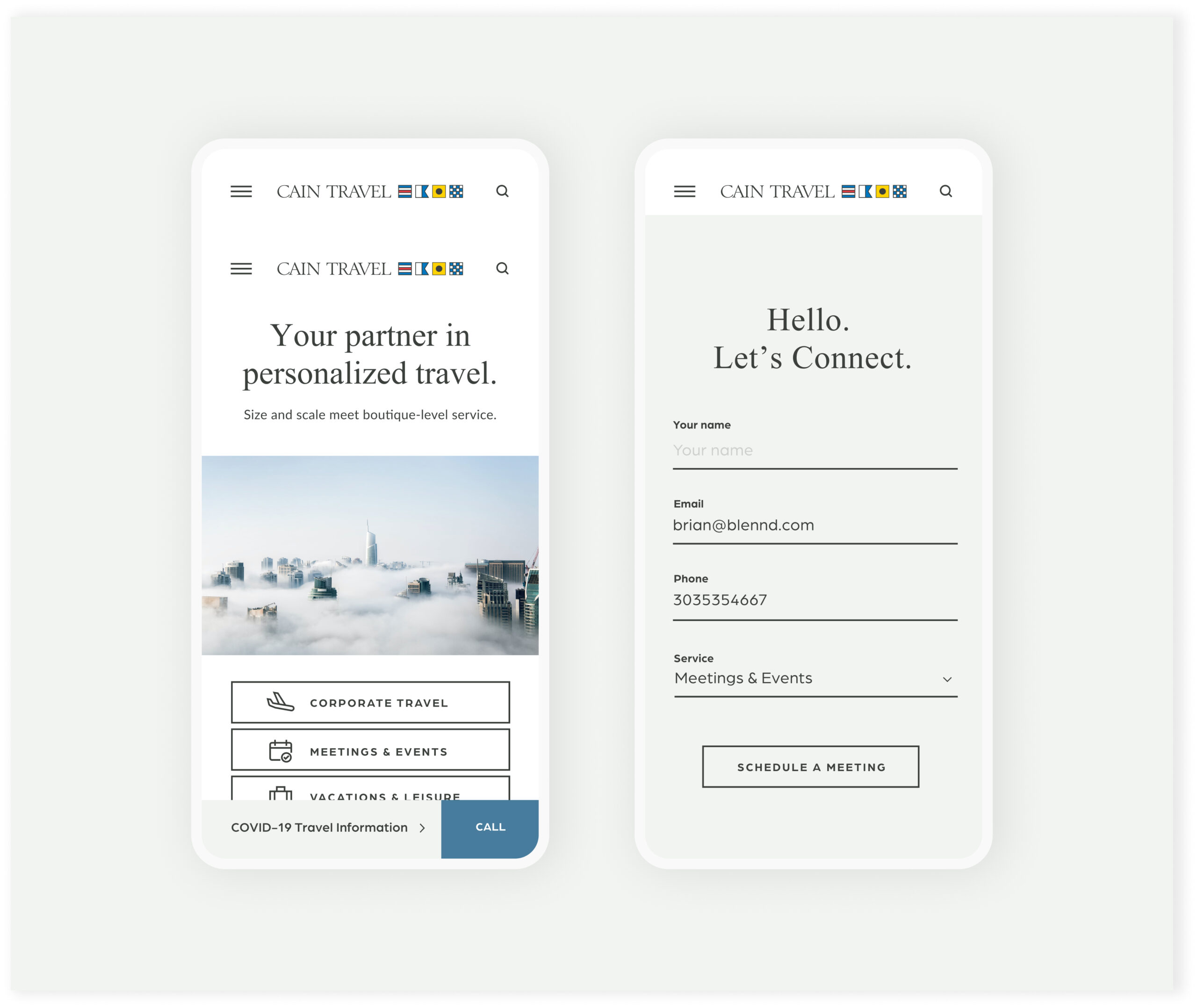
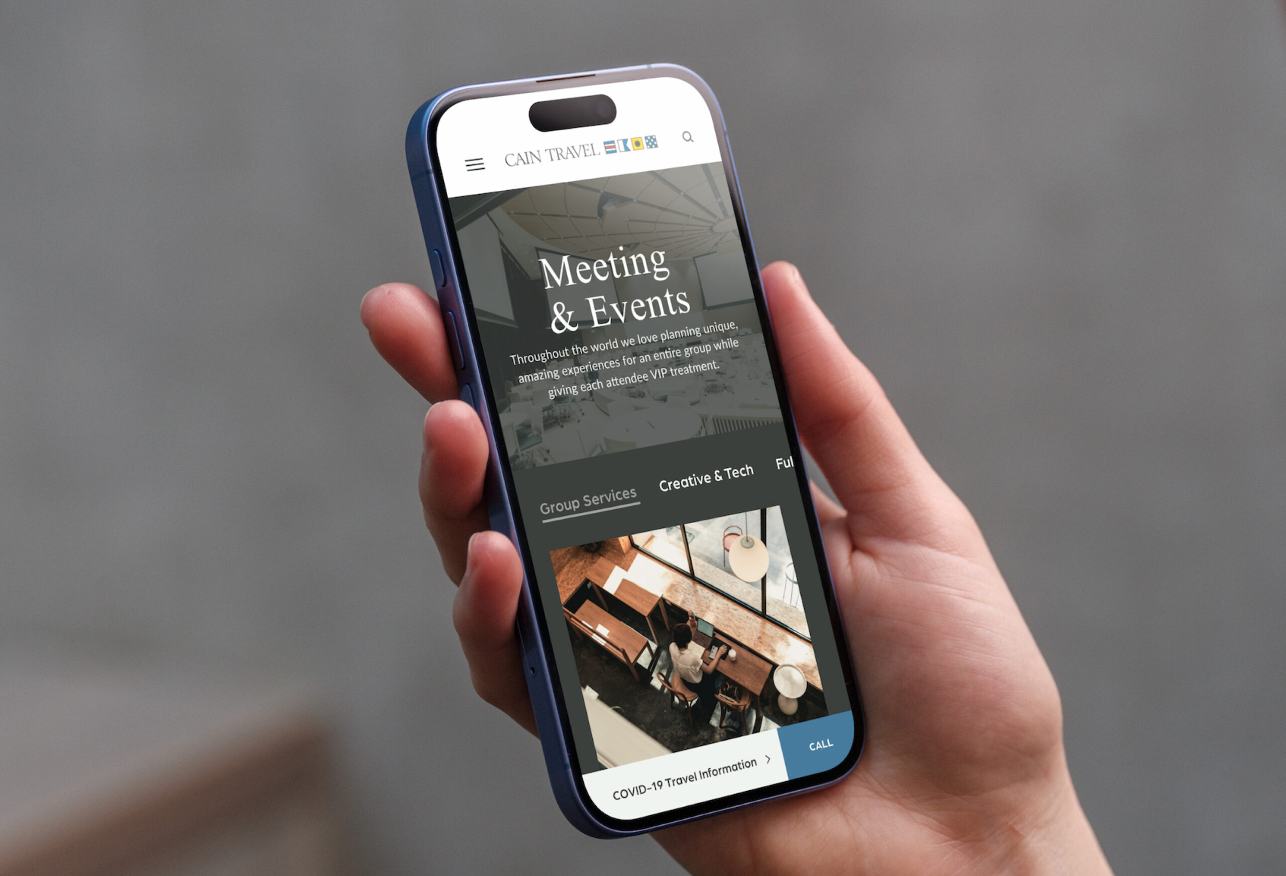
That strategy shaped both the brand and user experience. The new site was designed around Cain’s primary personas, including corporate travel, meetings and events, and vacations and leisure, allowing users to quickly self-select into the path most relevant to them. Key features such as client support were elevated into the main navigation, while high-interest content like COVID-19 updates became more accessible through a visible notification bar. HubSpot integration was also built into the experience, making it easier for users to submit inquiries and for Cain’s internal team to manage content and lead flow more efficiently.
The Results
A more modern website with stronger usability, cleaner SEO, and early organic growth.
The new website gave Cain Travel a digital presence that finally felt aligned with the business behind it. The redesign created a cleaner, more navigable experience that made information easier to find and better reflected Cain’s expertise, service model, and technical capabilities. Visually, the new design system balanced industry credibility with a more modern editorial feel, giving the brand a more distinctive and polished presence online.
The performance improvements were measurable from launch. The site achieved 99% SEO site health at launch, included more than 12 unique page designs, and generated 76 new organic keywords within the first month post-launch. More broadly, the project gave Cain Travel a stronger digital foundation for future growth, one built around real user behavior, stronger content visibility, and a more scalable platform for marketing, support, and continued optimization.
Explore more work.
Get started with a free strategy session.
Whether you need a new website, better performance, or a smarter growth strategy, we’ll meet you where you are and build what’s next. No guesswork—just clear strategy and execution.
