
PSC Partners Seeking a Cure
Designing a digital platform for connection, care, and research.
Industry
Education & Non-ProfitProject Overview
Creating a clearer path for a rare disease community.
PSC Partners Seeking a Cure is a mission-driven nonprofit supporting people impacted by primary sclerosing cholangitis, a rare liver disease with no approved treatment or cure. As the only organization in the U.S. dedicated to supporting the PSC community, PSC Partners serves a wide range of audiences, including patients, caregivers, parents, physicians, researchers, pharmaceutical partners, and donors.
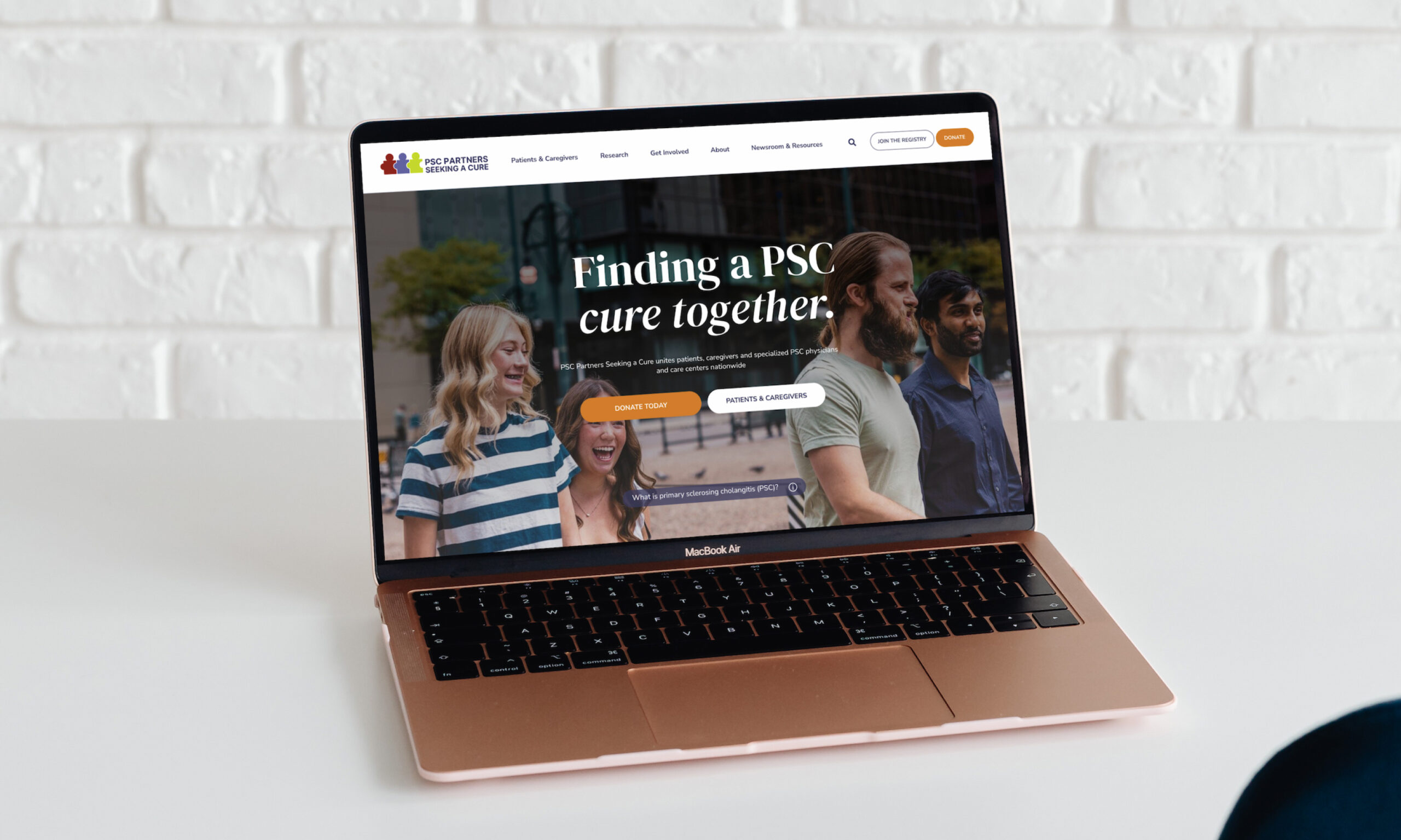
Blennd partnered with PSC Partners to redesign its website into a more approachable, organized, and action-oriented digital experience. The goal was to help visitors quickly understand where to go, what to do next, and how to connect with the organization, whether they were newly diagnosed, searching for a PSC specialist, looking for support, exploring research, joining the registry, or finding ways to contribute.
The Challenge
Turning overwhelming information into guided user journeys.
PSC Partners had an incredibly valuable depth of content, but the existing website made that content difficult to navigate. Years of volunteer-led updates, duplicated information, long pages, dense navigation, and overlapping audience needs created a site that felt harder to use than it should. Patients, caregivers, physicians, and researchers often needed different levels of information, but the website did not clearly separate those paths.
The challenge was not simply to make the site look better. PSC Partners needed a website that could reduce confusion, support emotional decision-making, make complex medical and research information easier to understand, and help visitors take meaningful next steps. That meant building an experience that balanced education, empathy, accessibility, community, research credibility, and clear calls to action.
The Solution
A calmer, more intuitive website designed around the people it serves.
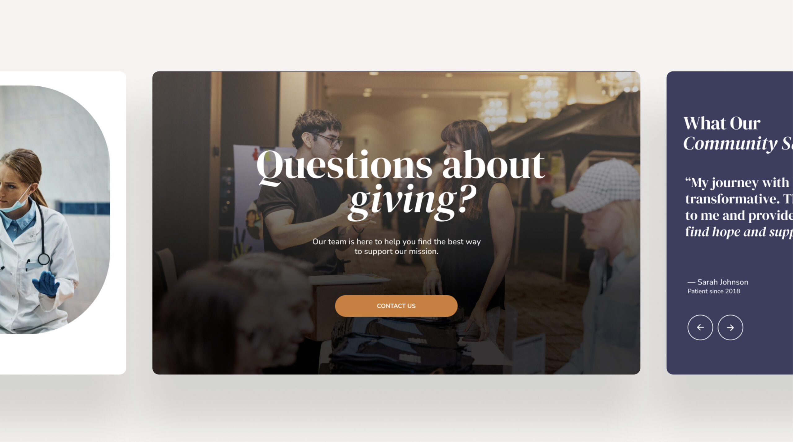
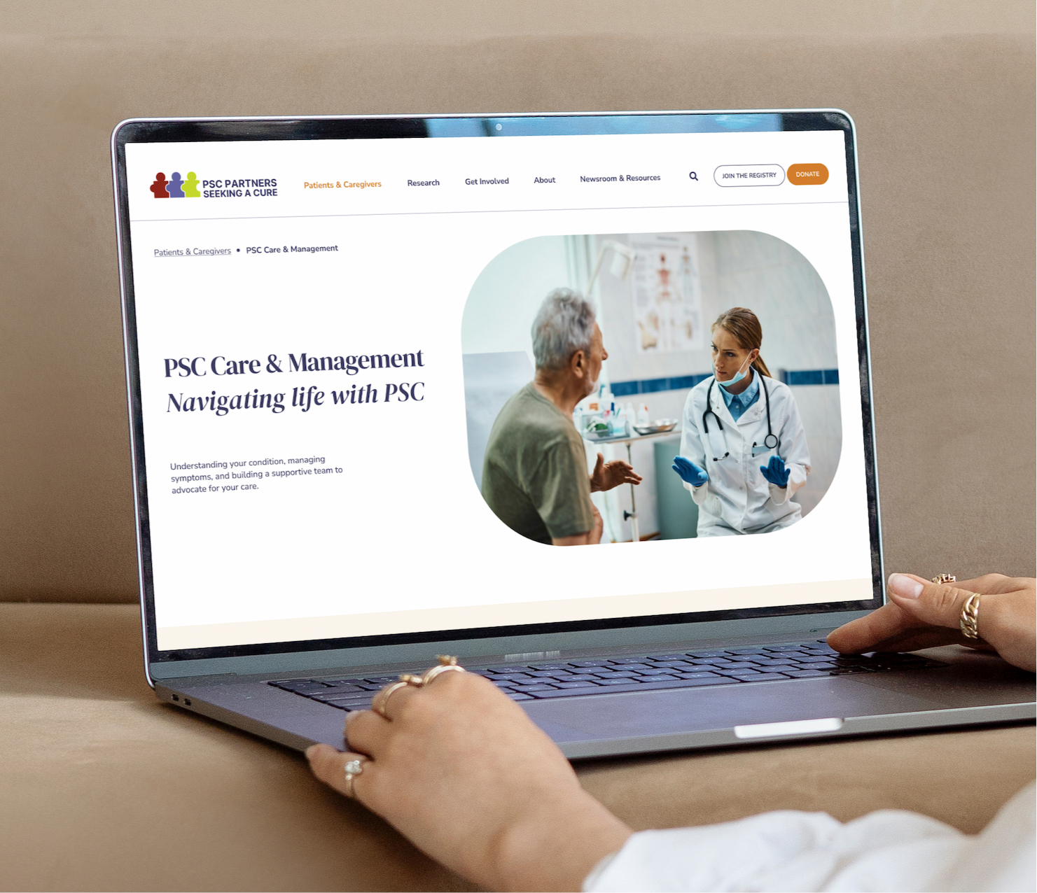
Blennd created a design direction centered on clarity, warmth, and ease of use. The new visual system uses generous spacing, soft rounded components, approachable typography, clear navigation, and patient-centered imagery to create a calmer experience for visitors who may be arriving during a stressful or uncertain moment. Early stakeholder feedback described the design as approachable, peaceful, informative, and easy to flow through.
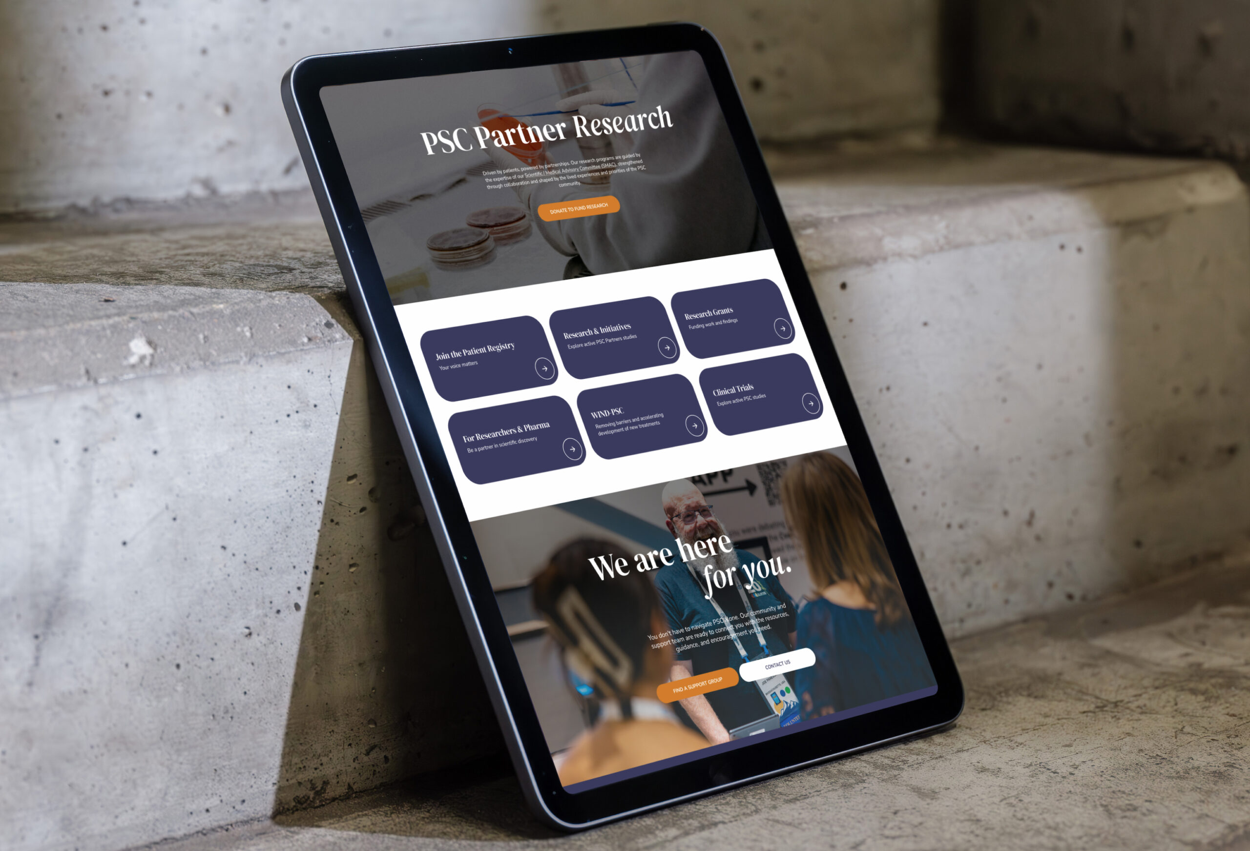
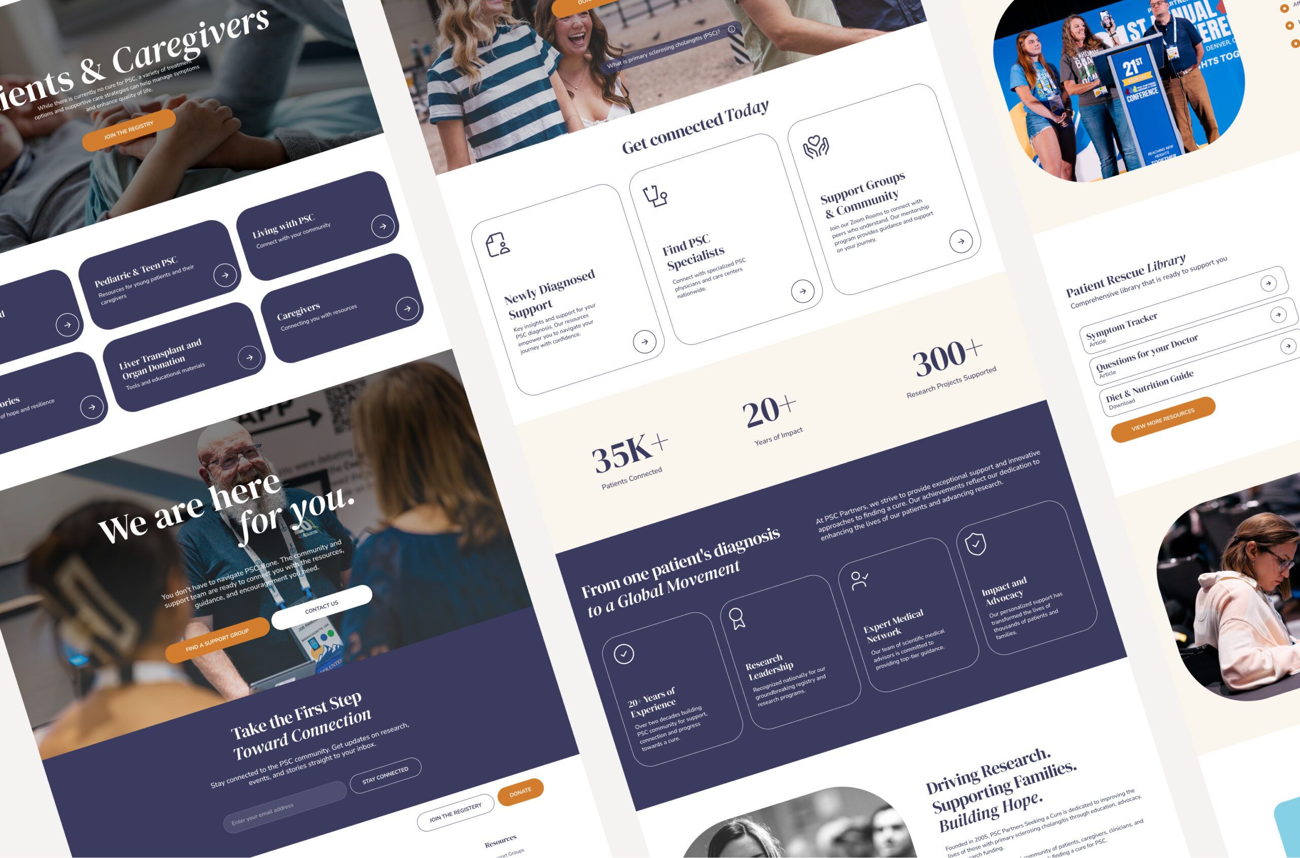
The redesigned experience organizes the site around key user journeys, including patients and caregivers, research, ways to get involved, newsroom and resources, Zoom Rooms, and the provider map. Flexible components make it easier to feature patient stories, related resources, upcoming support sessions, research initiatives, and action-oriented CTAs without forcing users into dead ends. The resource system was designed to support better tagging and related content, allowing PSC Partners to connect users with more relevant articles, videos, FAQs, and tools based on where they are in the journey.
The Design
Creating a warm, accessible experience for a complex patient journey.
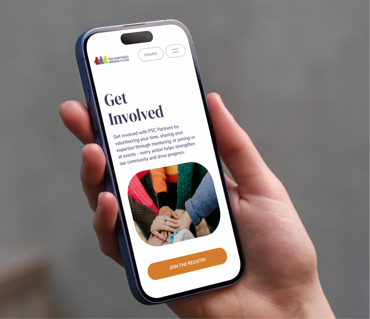
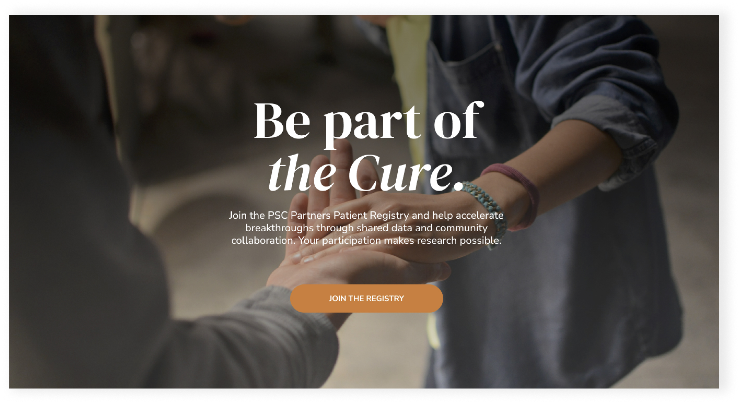
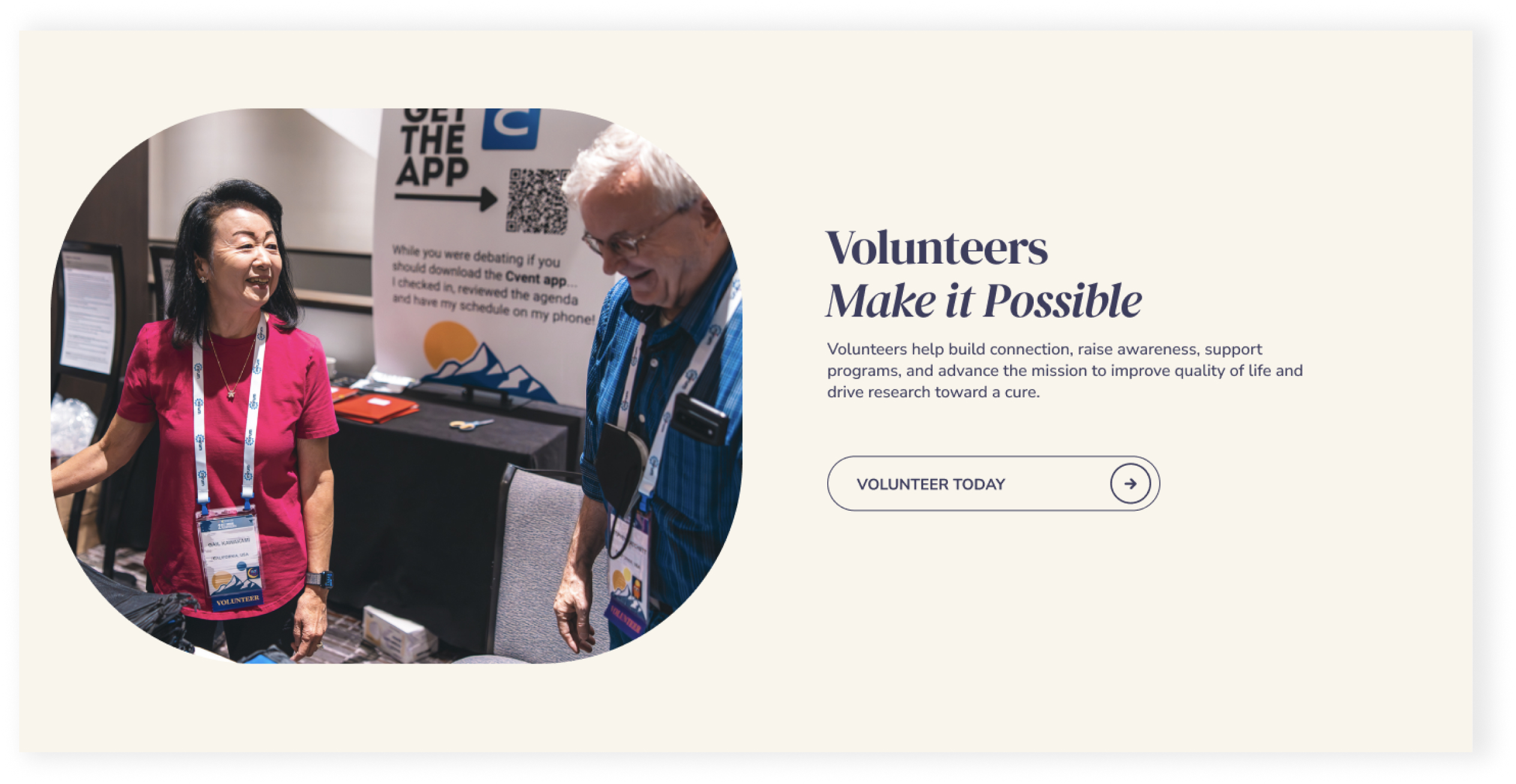
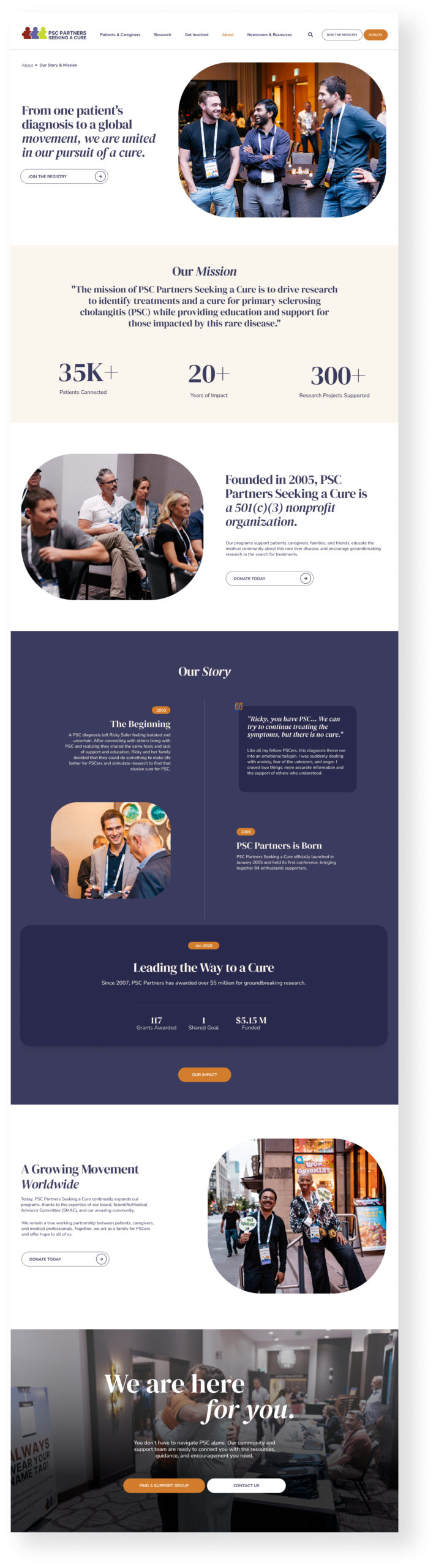
The design direction was built around one core idea: the PSC Partners website needed to feel calm, human, and easy to navigate. Many visitors arrive during an overwhelming moment, whether they have just been diagnosed, are caring for someone with PSC, or are searching for a specialist who understands the disease. The visual system uses soft rounded cards, generous white space, warm accent colors, supportive photography, and a refined serif type style to create a sense of reassurance without losing credibility.
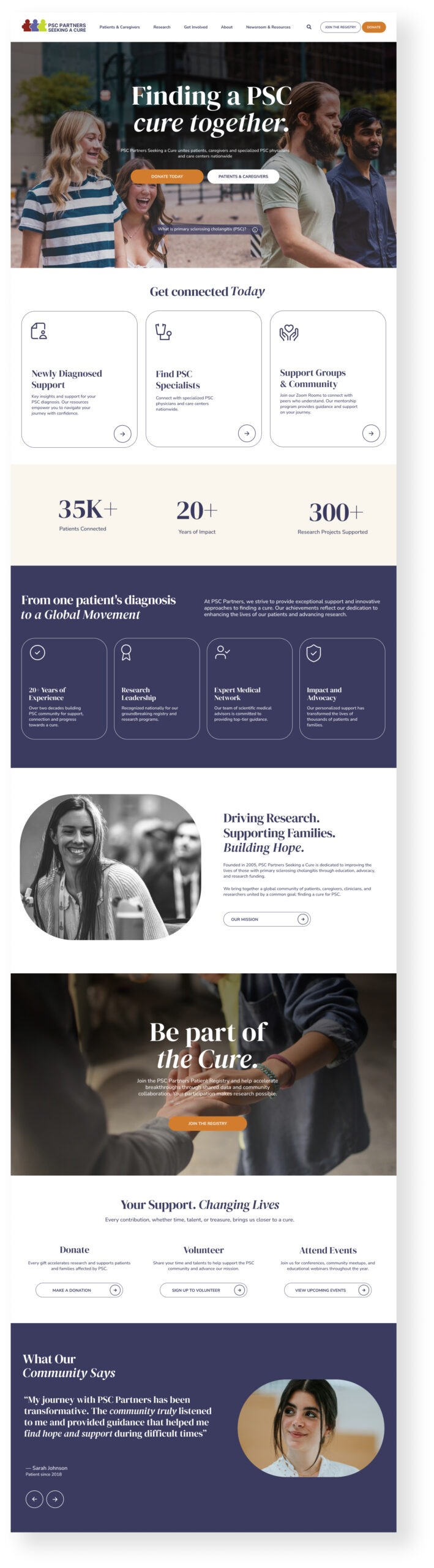
Each major page was designed to guide users toward the right next step. The homepage introduces clear pathways for patients, caregivers, research, support, and involvement. The provider map experience makes it easier to find PSC specialists. Zoom Rooms pages organize support sessions into a more usable event format. Resource and newsroom pages make educational content easier to browse, while research pages present complex initiatives in a more structured and visually engaging way. Across desktop and mobile, the design balances empathy, clarity, and action so PSC Partners can better serve both the emotional and informational needs of its community.
The Results
A stronger foundation for connection, education, and action.
The new website gives PSC Partners a more scalable digital foundation for serving a rare disease community with highly specific needs. Instead of relying on dense pages and repeated information, the new experience creates clearer pathways for newly diagnosed patients, caregivers, clinicians, researchers, and donors to find the information most relevant to them.
The redesign also gives PSC Partners a more flexible platform for future growth. The provider map, Zoom Rooms, resource library, patient and caregiver content, research pages, and registry-related CTAs now work together as part of a more connected digital ecosystem. The result is a website experience built to help people feel less alone, understand PSC more clearly, access trusted resources faster, and take meaningful action toward connection, support, research, and a cure.
Explore more.
Get started with a free strategy session.
Whether you need a new website, better performance, or a smarter growth strategy, we’ll meet you where you are and build what’s next. No guesswork—just clear strategy and execution.